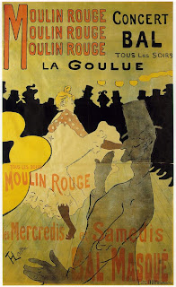
Introduction to the sequence :- Caption cards in the style
of Toulouse Lautrec from Van Gogh Museum Amsterdam “ Printmaking in Paris “
The rage for prints at the fin de siele.
Author - Fluer Roos Rosa de Carvalho and Marije Vellekoop.
2012 Van Gogh Museum Publications. ISBN 978 90 79310 296.
I have seen the original prints in the museum, and was very
impressed with the work from the period. It is very “loose”, very free and
instinctive looking.
Very few colours have been used, limited to three or four
with a very sophisticated modern result. This would be in contrast to work at
the time. This may be due to the fact Toulouse Lautrec was twenty one at the
time and ambitious at producing A0 posters needing three lithography stones to
make one large poster. This poster was produced in a print run of three
thousand.
Page 149 Prints Aplenty – Highlights
Plate 144
Henri de Toulouse-Lautrec
Moulin Rouge: La Goulue
Poster for the cabaret Le Moulin Rouge, 1891
Colour lithograph, 173 x 123.5 cm
At the start I thought that Toulouse Lautrec lettering was
going to be the solution but after researching posters of this period of French
graphic design I found that Toulouse Lautrec posters had lettering that was not
as expressive as I expected.
Researching posters in the book from the Van Gogh Museum I discovered that the work of
Pierre Bonnard were more expressive and sophisticated than Toulouse Lautrec.
Two particular pieces of Bonnards were more influential for me
Page 164
Plate 161
Pierre Bonnard
Artist’s Book Petit solfege illustre
By Claude Terasse, 1893
32 photomechanically reproduced colour lithographs,
published by Libraries-imprimeries reunites, Ancienne maison Quantin, 21.2 x
28.6cm.
Page 41
Plate 31
Pierre Bonnard
Poster for La revue blanche 1894
Colour Lithograph
80.4 x 61.8/77.7 x 58.7 cm
The next challenge was to design the lettering “1896
Olympics” in a way that would clearly position the visual language of the
letter forms to the viewer by communicating graphic design lettering of this
Olympic period.
The second challenge, as this lettering was going to be
animated it had to work on its own was to make the lettering work without
illustrative supporting images as I quickly realised that Toulouse Lautrec
posters were a marriage of image and text.
The typography is very free and appropriate to the period I
am looking at.


